Want to build an Email Optin page? Here is the guide to making an attractive Email optin page.
Today, opt-in marketing is becoming more and more crucial for companies of all kinds. The fact is that customers nowadays are interested in something other than being constantly barraged with irrelevant advertisements. It’s incredibly simple to tune out and disregard commercials that haven’t asked for our consent because they are continuously there on television, radio, the websites they visit, and on billboards along the road as they drive or walk.
Optin marketing is consent-based marketing that uses an Optin process where users confirm their email addresses or contact numbers. Let’s find out more about the best ideas for creating an effective email signup popup that will help you to attract potential clients.
- RELATED – 8 Email Writing Tips to Improve Conversion
- Top 5 Ways to Find Someone’s Email Address Easily
How to make an Email Optin page more attractive for your customers?
To get a subscription, the website visitor must submit his e-mail address to receive exciting updates and fantastic deals. Such forms can be placed on any page of the site, which can have a variety of designs. When a client subscribes, it implies they agree to receive all of your marketing messages. Numerous strategies may be used by businesses to get subscribers to join up for their marketing messages. Have a look at the six most effective options for the Email Optin page:
- Barter: You provide the customer with a “sweet bun” — get a free eBook, PDF, template, or guide. Or it can be a welcome gift, a coupon, a freebie, or a discount — in return for their contact information, permission to handle their data, and agreement to receive newsletters from you. The customer thinks “why not?”- and he is already a member of the loyal base.


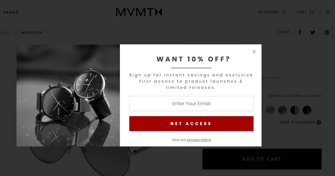
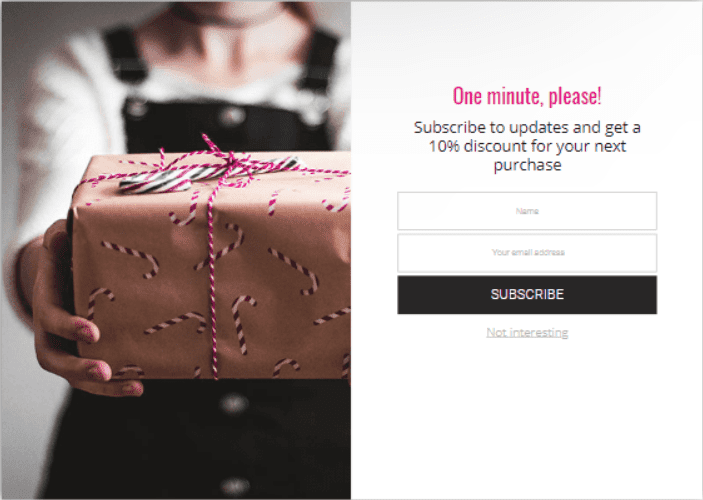
In these examples, you will get a 10% discount after entering your email address. It is just one of the most popular types of Email Opt-in pages among a great number of them.
It is crucial to understand thoroughly your target audience to apply this strategy effectively. You should know their interests, their issues, how to solve them, and what incentives would appeal to them.
- Advice: When working with clients who prefer live communication, such a type of Email Optin page may be quite useful. If the customer inputs an email address, an offer to contact him back and give him advice on products or services is frequently in demand. This will significantly boost early sales. The visitor frequently experiences uncertainties before placing an order. A consultation is like a tranquilizer for the consumer, giving them the chance to put off making a costly purchase until later. It is important to emphasize that the consultation is free to motivate people.
- Promotions and discounts: Email Opt-in pages can be changed during seasonal sales, for special occasions, for limited-time deals, for product suggestions, etc. The primary objective is to boost sales, especially recurring business. When creating incentives, it’s crucial to give a precise and accurate discount figure and to make the promotion’s terms crystal apparent.

- Engaging Call To Action: A call to action is perhaps one of a page’s most essential aspects. Text with a dull message like “download now” won’t make customers who aren’t sure to do that. You require a CTA button that people can’t help but click. Here is a great example that makes you enter your email and find out what the “heatmap” meaning is.

- Examine and modify the registration form: When a customer chooses not to register, it’s not always because they don’t want to provide you with their email address. They simply dislike your Email Optin page appearance. That is an honest issue, especially if you previously used a simple form template and haven’t used it since.
- Create a feeling of FOMO: The fear of missing out, the belief that others are having more fun, leading better lives, or having greater experiences is known as FOMO. Here is one more tactic to enhance your Email Opt-in page.
You can always keep up with what your friends, coworkers, and even former high school classmates are doing thanks to social media, where everyone posts about their life. You are more inclined to follow the crowd the more others who do the same thing. This psychological herd mentality may be used as a handy marketing technique. Would you inform a hesitant client of how many other individuals have downloaded your opt-in offer? The importance of your business is also demonstrated by including a significant number of clients. You can show how many clients have previously signed up for your newsletter or use your product for FOMO. That can persuade hesitant clients to provide their email addresses ultimately.
- RELATED – How to Recall an Email already sent in Gmail
- How to stop unwanted emails in Gmail OR How to block spam emails
Conclusion
Customers and subscribers can decide whether or not they wish to receive marketing messages when they are on your Email Optin page. For your company, this includes ensuring that each subscriber to whom you send marketing emails agrees to do so. Consent marketing may help you abide by data protection regulations, preserve your email sender reputation, and foster stronger client connections by building a rapport with your audience.
Permission and consent are the foundations of consent marketing, which guarantees that your company will only offer its products to clients who choose to do so.
There isn’t and won’t be a singular, effective recipe for the perfect Email Opt-in page. However, there are specific needs and general advice that should be taken into consideration while making adjustments. After that, you’ll enjoy testing and monitoring the outcomes. Try several things until you discover the one that works best for you and yields the highest conversions.
But remember, getting someone to sign up for your email list is just the start. That email subscriber needs to be turned into a paying client as well as to become a recurring customer.
I hope this tutorial helped you to know about the 6 Simple Tips on Building a Killer Email Optin Page. If you want to say anything, let us know through the comment sections. If you like this article, please share it and follow WhatVwant on Facebook, Twitter, and YouTube for more Technical tips.
6 Simple Tips on Building a Killer Email Optin Page – FAQs
Is a landing page and an Opt-in page the same?
The key difference between a landing page and an opt-in page is that an opt-in page is a lead generator, while a landing page moves the leads you generate along the customer conversion process by providing a single focus on the next step.
How do I create an Opt-In Link?
Locate share your opt-In link and select Get Started to the right of this option.
What makes a good Opt-In?
First, match up your idea, audience and format, and remember to test to get the balance right. The best Opt-In lead magnets offer to save a single problem for users. Avoid having options with multiple calls to action (CTAs); your visits are likely to get confused.
What is a good opt-in percentage?
Broadly speaking, a common conversation rate for an email opt-in landing page is between 5% and 15%. The companies with the most success tend to convert at around 20-25%.
What is main benefit of opt-in emails?
One of the biggest advantages of having an opt-in email list is the fact that you own that resource, and it can serve as a significant pillar for future success. No matter how many followers you have on social media, in the end, the algorithm determines how many people will see your content.
